Our first query against the SQL data will look like this.
select top 10000 convert(date,SessionTime) as [Date], avg(CallerRxAGCNoiseLevel) as [Caller Noise], avg(CalleeRxAGCNoiseLevel) as [Callee Noise] from AudioStreamDetailView group by convert(date,SessionTime) order by convert(date,SessionTime)
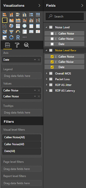
From here I am going to create a line visual in Power BI and assign the following elements to the graph.
This should give us a visual that will look like this
Now our 2nd query we are going to add will be this.
select top 10000 convert(date,SessionTime) as [Date], avg(CallerRecvNoiseLevel) as [Caller Noise], avg(CalleeRecvNoiseLevel) as [Callee Noise] from AudioStreamDetailView group by convert(date,SessionTime) order by convert(date,SessionTime)
From here we will create the Power BI visual with the following data
And our line chart will generate something like this
Next week we will plot out some visuals for video calls and show sending and receiving frame rates.
Doug Routledge, C# Lync, Skype for Business, SQL, Exchange, UC, Full Stack Developer BridgeOC Twitter - @droutledge @ndbridge |


